Do Not Touch is an installation by the German artist Christian Moeller at London’s Science Museum. Signs on the floor around a tall metal pole say DO NOT TOUCH in large letters. The artwork aims to create conflict by tempting you to do the very thing you are being warned not to do. If you do ignore the warning and touch the pole, you may – or may not – experience a mild electric shock.
Child A and I watched from a safe distance, as some visitors found the temptation too hard to withstand. We particularly liked the guy walking past in a Jesus Loves Techno T-shirt and the bloke who got a shock himself and promptly brought his girlfriend back to try it.
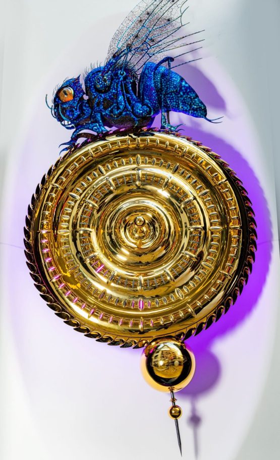
Earlier this year I was stopped in my tracks by the sight of this clock in London’s Science Museum, which is almost the twin of one I’d seen in Cambridge a few months previously. How many of these scary mechanical sculptures could there be? Just the two, it turns out – according to johnctaylor.com:
“Named The Midsummer Chronophage because it was first exhibited on 23 June 2010, the creature on top of this clock appears battle-hardened with leathery, spiked skin and weathered limbs.”
“It walks relentlessly above the face. The wings rock backwards and forwards, together with the haltares (evolved from wings and now used to help balance). The bulbous eye blinks randomly.”
“The Chronophage’s mouth opens slowly, suddenly snapping shut every 60 seconds to bite off the minute just passed. With glowing tongue lolling, the creature appears to masticate while digesting time.”
“On the quarter hour the forked tail stings, quivers and slowly sinks. On the strike of each hour, the number of stings matches the unearthly chimes.”
Chronophage literally means “time eater” – from the Greek “Chronos” (time) and “phago” (eat) apparently – and this shockwave version can be downloaded as a free desktop app or screensaver.
However the Corpus Chronophage [More]

Until 1966 Dad worked for the PLA and this logo, glimpsed on a trip to the Science Museum the other week, gave me a flash of being a kid again. There was one occasion when Dad took the family on a tour of the port in its full glory before the Royal Docks began closing one by one. If only I could remember more about it.
Instead, all that remains is a hazy impression of vastness, richness, density – hordes of people, cars, lorries, ships and cranes. Jumbled flashes of standing astride the central gap on Tower Bridge, St Katharine’s dock full of ships, Cable street, the river police – and more people of colour than I’d ever seen in my life.
Pointless wishing dad had taken photos on that family outing. To him it was mundane scenes from his working life, and he was unsentimental to a fault. He left the PLA just before the port’s traffic was transferred to the container port at Tilbury – where a single crane operator could do the work of dozens, maybe even hundreds of dockers. On the bright side, at least we got Fortress Wapping and Canary Wharf in return.
As so often, when you can’t remember what something looked like, Google will remember it for you. The top result for “Port Of London 1966” was this lovely image of the port in its last pomp in glorious 60s Kodacolor, taken by Ken Smith.

